Are We at the Peak of AI Design? Why Generic Perfection Is Killing Brand Identity
By Rahul Vithala · · 7 min read
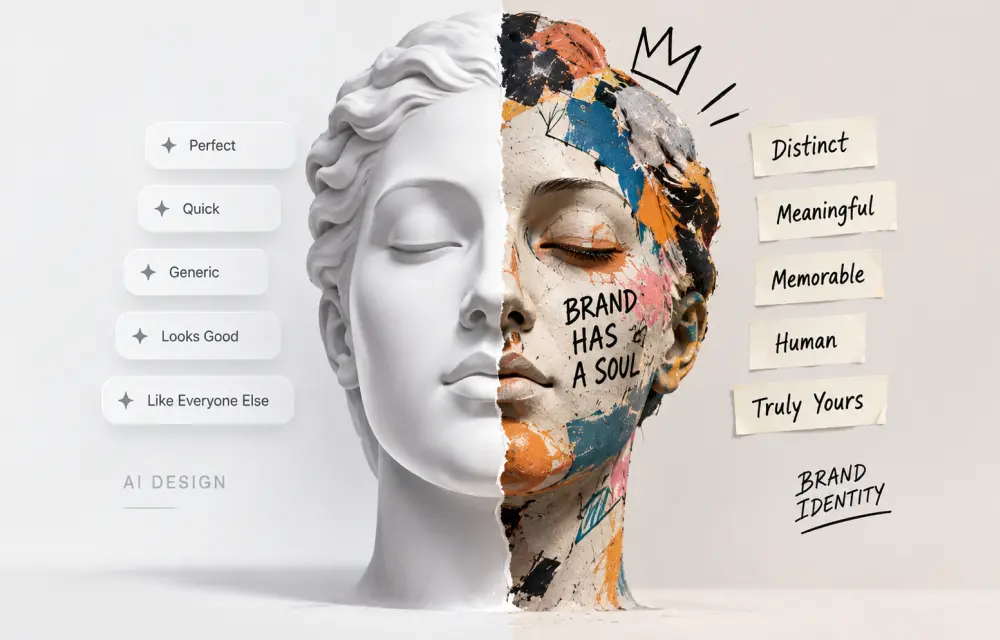
Everywhere you look, the internet is starting to feel the same.
SaaS landing pages with identical hero sections. Rounded cards. Soft shadows. Beige and orange colour palettes. Gradient backgrounds. Tiny sidebar icons. Sparkle emojis as logos. Shimmering loading text. Inter or Poppins fonts. Three-column feature grids. Perfect mockups. Flawless illustrations. Polished but empty.
As a digital marketer, you are not imagining this.
AI design tools have made it incredibly easy to create beautiful-looking websites, social media posts, product mockups, icons, banners, and landing pages. But they have also created a new problem: visual monotony.
When everyone can generate “perfect” designs, perfection stops being special. It becomes noise.
The real question is not whether AI design has reached its peak. The real question is whether brands are willing to accept generic, AI-flavored sameness as their visual identity.
Why AI Designs Look the Same
AI design tools are not broken. They are working exactly as they were trained to work.
They are trained on huge amounts of existing web designs, UI kits, templates, popular apps, and trending visuals. The model learns what “good design” looks like based on patterns in its training data.
Then, when you ask it to create a design, it produces the statistical average of what it has seen before.
This is called distributional convergence. It means the output tends to move toward the centre of the training data instead of exploring new directions.
That is why so many AI-generated interfaces look similar:
-
Rounded corners and soft drop shadows.
-
Sans-serif fonts from the Inter, Poppins, or DM Sans family.
-
Light backgrounds with pastel or orange accents.
-
Centred hero sections with a headline, subheading, and call-to-action button.
-
Three feature cards with icons.
-
Beige, cream, or off-white colour palettes.
-
Tiny icons, sparkles, and “thinking” animations.
A 2025 arXiv study on design homogenization in AI-generated web interfaces found exactly this: vibe-coded products converge rapidly toward a shared aesthetic baseline derived from dominant style conventions in training data.
This is not a quality problem. It is a prediction problem.
The AI is doing what it was designed to do: produce outputs that resemble what most products look like.
The Problem With “Too Perfect” Design
When a design is too perfect, it often feels soulless.
Everything is aligned. Every card has the same spacing. Every icon is clean. Every gradient is smooth. But there is no tension. No personality. No brand story. No human decision.
As one designer wrote in 2026, AI output often looks “hyper-polished in a way that feels empty.”
This is especially visible in mockups. AI can generate flawless product images, perfect device frames, beautiful lighting, and clean shadows. But the scene often feels staged. It does not look like a real brand with a real product. It looks like a stock photo that has been slightly modified.
For a digital marketer, this is dangerous.
Your brand is not competing only on features or price. It is competing on identity. People choose brands they can recognize, remember, and trust.
If your website, social posts, ads, and mockups look like fifty other AI-generated brands, you lose that advantage.
When Perfection Becomes a Weakness
There is a reason why some of the most memorable brands do not look “perfect.”
They look human.
Hand-drawn illustrations. Rough textures. Imperfect layouts. Bold typography. Unexpected colour combinations. Experimental photography. Real people instead of stock models. Messy whiteboards. Screenshots with annotations. Founder stories. Behind-the-scenes content.
These choices are not accidents. They are decisions.
AI can copy a style, but it cannot make a brand decision. It does not know why your business exists. It does not understand your customer’s frustration. It does not feel the tension between being bold and being safe.
A human designer does.
This is why AI-generated designs often feel generic even when they are technically correct. They lack intention.
One designer described this well: “Nothing’s broken. No single detail is ugly. It’s just generic in a way that quietly says ‘no human decided this.’
That is the core problem.
The Human Touch in Design
Human design is not about making things ugly. It is about making things meaningful.
A human designer asks questions before opening any tool:
-
Who is this for?
-
What problem are we solving?
-
What should the user feel?
-
What makes this brand different?
-
What visual language matches the story?
-
What should be emphasised, and what should be quiet?
-
What is the long-term brand direction?
AI can generate options. But only a human can choose the right direction.
This is why the best workflows in 2026 are not “AI versus humans.” They are “AI-assisted, human-led.”
Use AI to:
-
Generate early concepts.
-
Create layout variations.
-
Speed up repetitive tasks.
-
Produce draft copy and structure.
-
Explore colour palettes and typography.
Then use humans to:
-
Define the brand voice and visual identity.
-
Choose the strongest direction.
-
Remove what does not fit.
-
Add personality, story, and meaning.
-
Ensure accessibility, usability, and performance.
-
Build a design system that future work can follow.
Without that human layer, AI output remains a draft, not a deliverable.
Why Content Also Needs a Human Voice
The same problem appears in content.
AI can write clean, grammatically correct copy. It can generate blog posts, social captions, landing page text, and email sequences. But the tone often feels flat.
It sounds like everyone else.
It uses the same phrases:
-
“In today’s fast-paced world…”
-
“Unlock your potential…”
-
“Transform your business…”
-
“Seamless experience…”
-
“Cutting-edge solution…”
This is not because AI is weak. It is because AI is trained on content that already exists. It learns the average of what has been published.
If your brand wants to stand out, it cannot speak in averages.
It needs a point of view.
A human writer can take your customer stories, your founder’s lessons, your team’s experience, your mistakes, your unique process, and your actual results—and turn them into content that feels real.
AI can help structure that content. But only a human can give it a voice.
The Risk of AI Design Monotony for Marketers
For digital marketers, the risk is clear.
If every brand uses the same AI tools, the same templates, the same prompts, and the same design patterns, then visual differentiation disappears.
Your ads start to look like your competitor’s ads.
Your landing pages start to look like every other SaaS landing page.
Your social posts start to blend into the feed.
Your mockups start to feel like stock images.
Your brand becomes forgettable.
This is especially dangerous in crowded markets. When products are similar, design and storytelling become the main differentiators.
If your visual identity is generic, your product will feel generic too even if it is not.
How to Break the AI Aesthetic
The escape from AI monotony is not to reject AI. It is to use it with intention.
Here are a few practical steps:
1. Build a design system first
Before generating anything, define your brand’s visual language. Colours, typography, spacing, tone, imagery style, icon style, layout patterns, and content structure.
Then use AI to create within that system instead of accepting its default style.
2. Add constraints
Tell the AI what not to do. No gradients. No rounded cards. No beige palette. No stock illustrations. No generic icons. Constraints force the model away from the average.
3. Use real assets
Replace AI-generated people with real customer photos. Replace fake screenshots with your actual product. Replace stock backgrounds with your office, your team, your process.
4. Write like a human
Use your customer’s language. Share real stories. Show mistakes. Avoid marketing clichés. Let your founder’s voice appear in the content.
5. Treat AI output as a draft
Never launch the first AI version. Review it, edit it, remove what feels generic, and add what feels true to your brand.
The Future Is Not AI Versus Human
AI design has not reached its peak. It will keep improving.
But the brands that win will not be the ones with the most AI-generated content. They will be the ones that use AI as a tool, not a strategy.
AI can create speed. Humans create meaning.
AI can create options. Humans create direction.
AI can create polish. Humans create personality.
For TheTechHacker Digital, this is why we see AI as a powerful assistant, not a replacement. It can help us move faster, explore ideas, and reduce repetitive work. But the final design, content, and strategy must come from human understanding.
Because in a world where everyone can generate perfect designs, the real advantage is not perfection.
It is humanity.